You’ve hired a web development company—ideally Rare Bird, the most trusted modern marketing company in the Midwest—to build a new website for your business. You have a sleek design in mind, something with eye-catching visuals and seamless, intentional navigation. But what’s the point of a beautifully designed website if it lacks meaningful and engaging content? Likewise, without an appealing design, visitors might not stay long enough to engage with even the most meaningful information.
Shouldn’t the process always start with content? A website provides valuable information to its audience, after all. Movies aren’t made without a script, and writing is the first step in the creation of comic books, TV shows (even “reality” TV, often), many podcasts, radio ads, brochures, billboards, and so much more. Banner ads may only have room for three words, but the process begins with choosing those three words.
Those who share this view argue that content, as the heart and soul of a website, should determine the design—the structure, layout, and even functionality—of a website. Like the recipe for your favorite dish, they argue, the ingredients and instructions necessarily come first. The preparation, presentation, and garnish follow. Some call it content-first design, in fact, the idea that design works with—and around—the content and its message.
A design-first approach carries certain risks. Valuable elements of a message can be lost when designers try to fit content into a design they already have in mind. They might choose to leave out a chunk of text, or even dip into editing the content themselves to better serve their vision, which means crucial elements of the message may be lost, and new problems introduced.
Some argue that design should take the lead, however. After all, a visually appealing website captures an audience’s attention, makes a strong first impression, sets the tone, establishes the brand’s identity, and creates a memorable user experience. A well-designed website can also guide visitors and make the content more accessible and purposeful for both the company and the audience. Just as a present attractively wrapped—with a bow, of course, and curly ribbons draped off the edges—entices the receiver to open it and discover what’s inside, a truly top-notch website design can make a first impression so good that users may not initially notice whether the content meets their needs.
MailChimp defines content marketing as “the development and distribution of relevant, useful content—blogs, newsletters, white papers, social media posts, emails, videos, and the like—to current and potential customers.” The idea is that such expertise, if presented well, provides value to the customer experience.
Social media? Videos? Other stuff? That all sounds like it will require an even bigger creative team. Maybe a team the size of Rare Bird. And to create a successful website and larger marketing effort, a collaborative approach is a must. Content and design are often best developed simultaneously, with constant communication and feedback between team members.
Right about now, I’m imagining our front-end developer, Josiah Schaefer, deftly pointing out that content and design are not opposites. Everything on a website is content, he might remind us. Using content when we really mean copy—the words—might be part of the problem. Content is something that is written, designed, and produced. A video is content. So are downloadable brochures, case studies, and white papers. We think of content as something to put into (onto?) a website, as if the website is a container and everything gets poured inside. But a website is not just another medium through which we might communicate with audiences; it is the communication itself.
Everyone wins when design is tailored to support the content and convey and amplify the brand’s personality, values, and messaging, and when content (that is, the writing) is crafted with the design in mind. Writing and design are not mutually exclusive endeavors. The key is to strike the right balance between the two, like a dance where each partner’s efforts enhance the other’s performance.
“In the end, it really has to be a collaboration of the writer and designer working together throughout the process,” says Ashley Nixon, Rare Bird’s design director. “You can’t expect the perfect content or the greatest design to be handed to you without that communication first.”
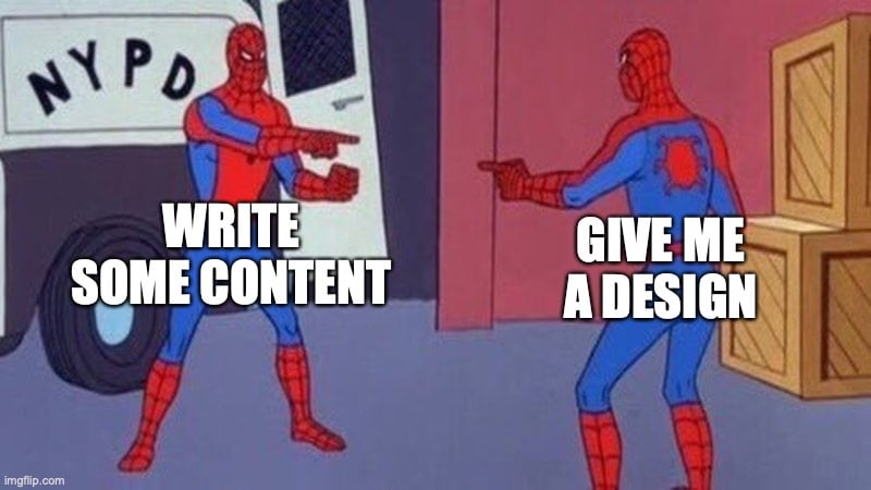
For that reason, Ashley wrote me on the day this post was scheduled to be published to ask if I had written any copy she could read before helping figure out what images we might use. She did have one idea—back in January, I shared a meme I’d made with her and another designer, Alysia Legler. I originally had the idea for the meme not long after starting at Rare Bird, but I didn’t share it right away. I was still trying to understand the process of working alongside four different designers, each of whom is talented in complex and unique ways. They are not a monolith, as they exemplify the range of collaborative options and individual tendencies explored in this article.
But with seven words, I’d stumbled upon the perfect summary of our process. Not long after the image appeared to them in Slack, a laughing emoji appeared. Alysia printed it out to hang above her desk in the office.
“That could be a whole blog post,” Ashley said.
Good idea.

You might also like:
Rare Bird delivers versatile marketing and digital solutions to diverse clientele across nearly every industry. Ready to leverage our expertise to address your business needs?
Let's talk.