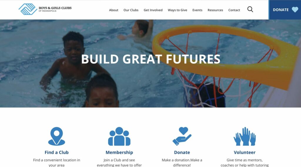
More than simply selecting fonts, typography plays an essential role in the effectiveness of web design—with the power to create mood, evoke emotion, and convey messages in ways that visuals alone cannot always achieve. Users skim and scan content at lightning speed, so the choice of typography can significantly affect user engagement, readability, and the overall experience of encountering a website.
Typography and Clear Communication
The primary function of web design is to communicate. Text is the most common medium through which information is conveyed on the web, though video, photography, graphics, and other elements also communicate key ideas. The way text is presented can drastically influence how information is received and processed by the user. A designer with a good grasp on typography ensures that the content is accessible, readable, and understandable, but more importantly, designers help guide users through the website by highlighting important information. In essence, the goal is to make the consumption of content as effortless as possible.
Choosing the right typeface, font type, size, and color is essential for creating contrast and hierarchy within the text. Headings, subheadings, and body text should be distinguishable from one another, of course, to help underscore what’s important. Line length, spacing, and alignment also play a significant role in readability, affecting how easily users can digest content.

Typography and Brand Identity
Typography is a powerful tool for expressing brand identity. The fonts chosen for a website can reflect a brand’s personality, values, and tone of voice. For instance, serif fonts are often associated with tradition, reliability, and respectability, making them suitable for the websites of law firms or financial entities. On the other hand, sans serif fonts can convey a sense of modernity, simplicity, and approachability, which might be ideal for tech startups, creative service agencies, or lifestyle brands.

Enhancing User Interaction
Typography can also significantly influence user interaction and engagement. Well designed typography can draw attention to calls to action, encourage users to engage with content, and gently nudge them through the conversion funnel. For example, emphasizing key phrases or calls to action with bold or accent fonts can capture users’ attention and motivate them to take the desired action. And now, as users routinely switch between desktops, tablets, and smartphones, typography must adapt to provide a seamless reading experience. Such responsive design includes adjusting font sizes, line heights, and spacing to enhance readability and ensure that the text is accessible on any device.
Typography Trends in Web Design
Typography trends in website design are continually evolving, reflecting changes in technology, design preferences, and user expectations. Some current trends include:
Variable Fonts: These fonts allow designers to adjust the weight, width, and other characteristics of a font on the fly, enabling more flexibility and creativity in typography design.
Color Fonts: Incorporating multiple colors within a single font, color fonts add a new dimension to web typography, enabling more vibrant and expressive text when appropriate.
Minimalist Typography: Emphasizing simplicity and clarity, minimalist typography uses clean, sans serif fonts and ample white space to create a modern, uncluttered look.
Custom Fonts: Brands are increasingly commissioning custom fonts to differentiate themselves and reinforce their unique identity. Custom fonts offer exclusivity and can be tailored to fit the brand’s personality perfectly.
Best Practices for Typography in Web Design
To leverage the full potential of typography in web design, consider the following best practices:
Prioritize Readability: Choose fonts that are easy to read and ensure that font sizes are appropriate for different devices. Pay attention to line length, spacing, and alignment to enhance readability.
Establish a Clear Hierarchy: Use typography to create a visual hierarchy, guiding users’ attention to the most important information. Differentiate headings, subheadings, and body text through size, weight, and color.
Be Consistent: Maintain consistency in your typography choices across all pages and devices to reinforce brand identity and provide a cohesive user experience.
Test and Iterate: Test your typography choices with real users to see how they affect readability and engagement. Be open to iterating based on feedback and changing trends.

Summary: Typography in web design is a critical element that goes beyond aesthetic appeal. It plays a pivotal role in communication, enhances brand identity, and influences user interaction and engagement. By carefully selecting and applying typography, designers can create more effective, user-friendly, and visually appealing websites. As the digital landscape continues to evolve, staying abreast of typography trends and best practices will ensure that your web design remains impactful, relevant, and engaging for your audience.
You might also like:
Rare Bird delivers versatile marketing and digital solutions to diverse clientele across nearly every industry. Ready to leverage our expertise to address your business needs?
Let's talk.