When you visit a company’s website, you want to examine what they do—to see the products and services offered, and also evidence of the company’s prior success. Whatever the circumstances, a click or search has delivered you to their page and an encounter with a precise combination of words and images designed to persuade you.
This process is rhetoric at its core: Words and visuals tasked with convincing an audience to take a specific action. Reach out today. Call now! Eat at Joe’s.
But talk is cheap, or so we’re told. Don’t tell audiences you make the best burger in town. Show them. A writer can wax poetic about the perfect blend of chuck and sirloin broiled over an open flame, but it’s more effective to share a photo of the burger itself. A fast-food commercial without sound is usually still effective.
Show, don’t tell is the first lesson in a creative writing course. As Anton Chekhov, the Russian playwright and short-story writer, famously stated in a letter to someone asking for writing advice: “Don’t tell me the moon is shining; show me the glint of light on broken glass.”
Communication that synthesizes the verbal and the visual, of course, both shows and tells—just like we all had to do in front of our first grade classes. With online content, you can’t rely on words alone, but the words must be good. Concrete and significant descriptions must convey an experience and evoke the world of the story. For your company’s website, the story is who you are, what you do, and why it matters to anyone visiting you online.
Rare Bird is the proud builder of many websites for an impressive and diverse range of clients across different industries. We are genuinely impressed with the products and services our clients offer, and we want to share them with our audience.
One of our clients, Mayer Fabrics, is an e-commerce business with a product that’s been in demand for more than a century, but is now more popular than ever. Another, Woodley Farra Manion, was just ranked #1 on CNBC’s list of top financial advisors. And if the readers who benefit from emails sent by Harvard Health Publishing every month lived in one place, it would be the third biggest country in Europe. That’s one reason for us to have a portfolio: Our clients’ success is astounding, and it’s fun to share their accomplishments with our readers.
Showcasing the websites we’ve helped bring into the world is also a way for future clients to better understand the possibilities that emerge when they choose us. For the Flock here at Rare Bird, there is also value in taking a moment to memorialize a moment of transition. We can pause and acknowledge the road we’ve traveled so far before straightening our gear and beginning the journey’s next leg.

Not to brag, but we’re pretty good at this website-building stuff. The shelves in our supply closet are loaded with the awards we’ve won over the years. (OK, that sounded like bragging.)
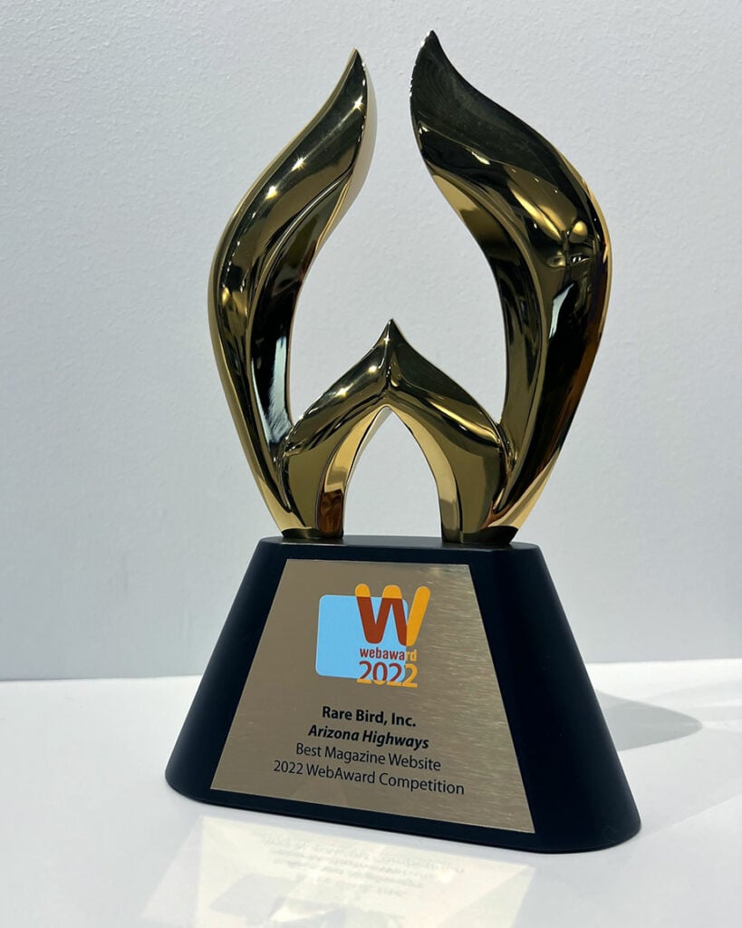
This year, the Web Marketing Association designated our work for Arizona Highways as the Best Magazine Website, while the website we made for Work and Learn Indiana won for Outstanding Website. Our work for Archos Advisors and Mayer Fabrics was recognized in 2021, as well.
For the full picture of what we do, visit the rest of our portfolio.
You might also like:
Rare Bird delivers versatile marketing and digital solutions to diverse clientele across nearly every industry. Ready to leverage our expertise to address your business needs?
Let's talk.