Creative people may enjoy a blank canvas, but creative professionals usually want some degree of clarity before engaging in a project. When asked to refresh a website or company logo, designers prefer at least a glimpse of insight and direction so they can avoid facing the tyranny of endless possibility.
Here at Rare Bird, most projects start with a conversation (and coffee!), followed by research and exploration. For designers, gathering quick flashes of ideas to which clients can quickly react saves time for everyone. We need that opportunity to interact with and get a feel for a client’s preferences. However we get there, establishing a framework within which designers can engage a project’s visual challenges is paramount.
One time, after discussing their competitor’s website with us, a client said, “No cartoon octopuses for us!” No Octopuses became a useful shorthand for remembering the client’s desire for a more serious—and seriously trustworthy—brand. The most satisfied clients often have ideas, but are open to considering where a designer’s expertise might lead them.
Because establishing a framework of engagement is crucial to moving things forward, one of a designer’s most popular tools is the mood board, even if some designers don’t like that name for it.
What Is a Mood Board?
In the simplest terms, a mood board is a space—usually digital, these days—to assemble various design elements that can help establish and visually articulate the overall aesthetic of a given project.
Photographs and other images, useful and distinguished typefaces, interesting textures, compelling colors, and more make their way to mood boards as designers collect inspiration early in the process. Later, designers can return to them as a reminder and go-to reference for what they may have originally intended, should the design become muddied along the way—which does happen, sometimes, after multiple rounds of feedback from various stakeholders.
“Mood boards are useful in determining the ‘mood’ and style of a brand or project direction,” says Alysia Legler, one of Rare Bird’s award-winning designers. “That helps determine what an organization wants in a project.”
Are Mood Boards Essential for Designers?
Because each client may involve a wide range of stakeholders—sometimes we work in support of a marketing team, and sometimes we are the marketing team—collaboration and communication are central to the design process. But it’s not always easy or efficient to convey visual and design concepts through words alone.
Mood boards can help generate discussion and decisions, which means they often play an important role in the earliest stages of a project. “With web design,” Alysia says, “sometimes the mood board is more concept-based, where we create a couple different homepage concepts that convey different moods and styles.”
The curation of a mood board is, if nothing else, a way to jumpstart a design project. It places necessary limitations on the endless possibilities available at the start of a project before a designer refines a particular concept. Every design is an opportunity to solve some kind of problem for clients. As author Warren Berger once said: “Design is really just creative problem solving.”

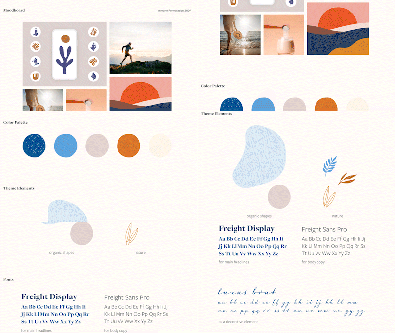
A mood board created by Rare Bird’s design director, Ashley Nixon, for a client.
Do Rare Bird’s Designers Use Mood Boards?
They do! (Except when they don’t.)
“I don’t use them often,” design director Ashley Nixon says, “but when I have it’s to get buy-in from a client on the direction I’m going without diving right into the design first.”
The last few times she used a mood board were when clients did not have a brand guide, and she needed a stronger approach to a website design. “You could design a website without a brand guide or a mood board,” she says, “but it ends up being more basic.” Ashley’s notebook is full of unique ideas, sketches, and layouts for clients, even when the client is us.
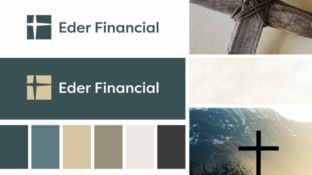
Likewise, Alysia cites her work with Eder Financial as another example how a mood board can be useful in branding projects, especially when the tone an organization wishes to establish is still in development. The company was rebranding, changing its name and overall look at the same time. “We wanted to focus strictly on their logo at the start,” Alysia says, “and then work on a color palette/branding treatment after we nailed that down.”

Do Mood Boards Unlock Creativity and Enhance the Design Process?
Admittedly, not every designer feels the need to use a mood board. As you might have noticed, Ashley is somewhat ambivalent about them. “They are probably a better idea than I give them credit for,” she says, “and maybe it’s really the term mood board that I don’t like. My problem is I spend time putting [the mood board] together—too much time—when I could just be designing. But sometimes that is a necessary step, depending on the client.”
Ashley raises a good point. Mood boards can aid the design process, but it is possible to get stuck in the planning stage—with actual progress lagging far behind. Eventually, choices must be made. Using mood boards to unlock creativity and get started is almost always a useful decision if designers keep the end goal in mind.
But the mood board’s most ardent supporters consider it a (mostly) risk-free way to explore new color palettes, experiment with different styles, and bring together a mix of disparate elements in the pursuit of innovation and unique solutions.
Rare Bird’s talented design team excels at finding unique design solutions to realize your vision—whatever your mood.
You might also like:
Rare Bird delivers versatile marketing and digital solutions to diverse clientele across nearly every industry. Ready to leverage our expertise to address your business needs?
Let's talk.