A landing page—the standalone web page on which a visitor “lands” after clicking on a link in an email, social media post, or online advertisement—encourages visitors to take a specific action, such as making a purchase or subscribing to a newsletter.
Widely used in digital marketing to improve the efficiency of advertising campaigns and increase the likelihood of converting visitors into customers, landing pages are frequently used in product launches, lead generation initiatives, event promotions, and other marketing activities.
Amid short attention spans and intense competition, what strategic elements should your landing page employ to maximize its effectiveness? Let’s look at a recent landing page we made for our client, Indiana Academy of Massage, and examine the key components that turn casual browsers into engaged customers.
In this example, we want users who land on this page to complete the contact form and begin the application process to this accredited and practical training program.
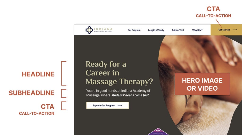
HEADLINE: GATEWAY TO ENGAGEMENT
The headline plays a pivotal role as the first interaction with visitors, requiring precision and clarity. Employing compelling language can effectively convey the value proposition or addresses a user’s problem. It’s crucial that the headline seamlessly aligns with the corresponding ad or link that led the visitor to the page, ensuring a cohesive and engaging experience from start to finish. Here, a simple question clarifies what this client is offering users and appeals to those who are considering massage therapy for a new career.
SUBHEADLINE: REINFORCE THE MESSAGE
The subheadline serves as a supportive element, offering additional context or expanding on the main headline to strengthen the overall value proposition. It should be succinct yet informative, providing a glimpse into what visitors can anticipate from the content ahead. Persuasive language entices users to delve deeper into the page, fostering a sense of curiosity and encouraging further exploration. In this subheading (or “subhead,” for short), the word play such as “in good hands” and an emphasis on meeting students’ needs enhances the headline and keeps the user moving down the page.
HERO IMAGE OR VIDEO: VISUAL APPEAL
A captivating hero image or video holds the power to evoke emotions, narrate a compelling story, or spotlight the featured product or service.When selecting visuals, prioritize the goal of capturing the user’s attention effectively with high quality and relevant imagery. Images that resonate with the target audience and seamlessly align with the overarching branding create a cohesive and visually engaging experience. We opted to use a video in the hero—which you can see if you click through to the actual landing page—that we made especially for Indiana Academy of Massage.
CALL-TO-ACTION (CTA): COMPEL THE USER
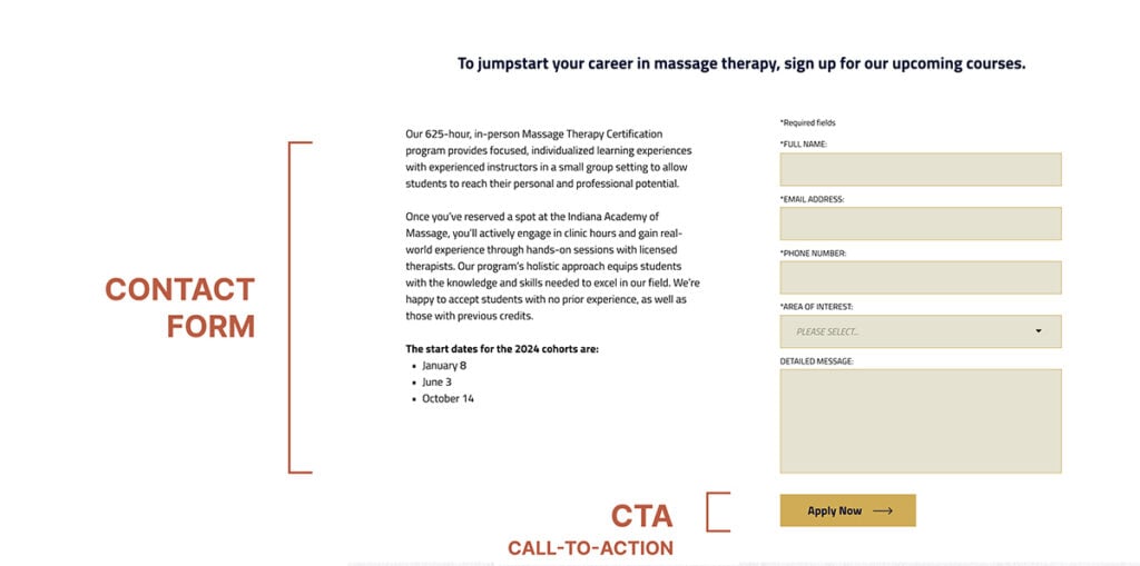
The Call to Action (CTA) marks the decisive moment when visitors choose to engage or abstain. Opt for succinct and compelling action-oriented language on the button, employing phrases such as “Get Started” and “Explore Our Program” to prompt user interaction. The CTA is prominently positioned in several spots on the page, and also readily accessible here because designer Mike Priami wanted to make sure the upper-corner “Get Started” CTA was available continuously as the user scrolls down this page.

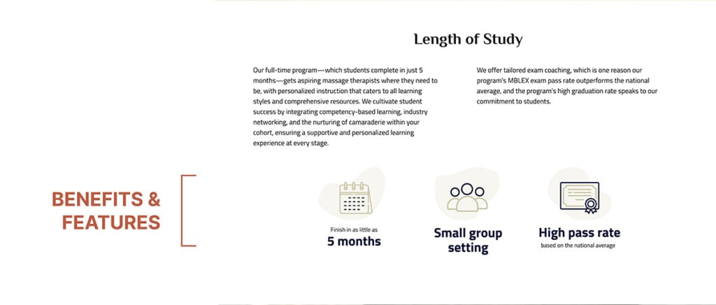
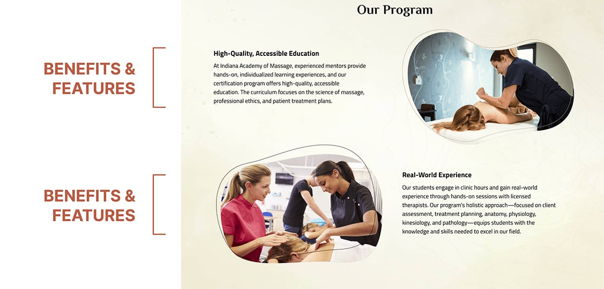
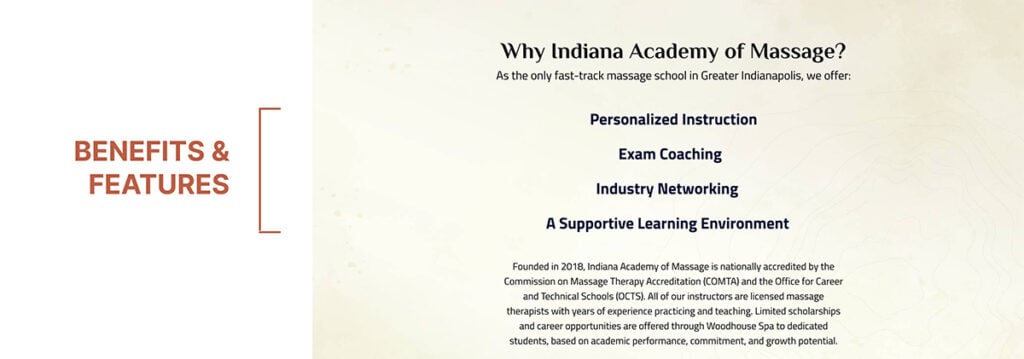
BENEFITS AND FEATURES: ADDRESS USER NEEDS
Outlining the benefits and features inherent in your product or service is essential, which is why this element is featured across three screenshots from our sample landing page. Placing an emphasis on how these attributes directly address the pain points or needs of the user is also a smart idea. Presenting the information in a concise and easily scannable format—brief paragraphs, short lists, and so on—can facilitate a quicker and more efficient consumption of the information. This approach helps users to swiftly grasp the value proposition, so they can better understand how your offering meets their specific requirements.
SOCIAL PROOF: BUILD TRUST
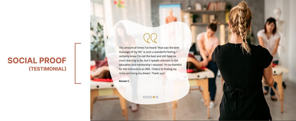
Incorporating testimonials, reviews, or certifications (sometimes called “trust badges”) is crucial for establishing social proof and bolstering credibility. Displaying positive experiences from past customers serves to reassure visitors about the reliability of your product or service. It’s essential to maintain the authenticity of the social proof and ensure its relevance to the specific offering, cultivating a sense of trust and confidence among potential customers. Here, a series of testimonials from past students allows interested parties to better understand what their own experience at the academy might be like.
CONTACT FORM: BALANCE INFORMATION GATHERING
When incorporating a form on a landing page, prioritize simplicity. Request only essential information from users. Clearly articulate the benefits of completing the form and consider the form’s placement on the page—shorter forms may be strategically positioned near the top for immediate engagement, while longer forms are often best placed after users have consumed valuable content. Here, we also chose to list the exact enrollment start dates for next year.
OTHER ESSENTIAL CONSIDERATIONS
- Visual Hierarchy: Guiding The Eye
A visual hierarchy seamlessly navigates users through the page. Contrasting colors and fonts help showcase prominent elements and contribute to an aesthetically pleasing layout. This strategy facilitates a user-friendly experience, directing attention to the most significant aspects of the content.
- Responsive Design: Ensuring Accessibility
Given that a substantial number of internet users access content across diverse devices, it’s imperative to ensure the responsiveness of your landing page, allowing it to adapt seamlessly to varying screen sizes. Rigorously test the page on multiple devices to guarantee a consistent and user-friendly experience, thereby accommodating the preferences and behaviors of a diverse audience.
A successful landing page results from a meticulous blend of compelling copy, engaging visuals, and user-focused design. Businesses can attract and guide visitors toward conversion by comprehensively understanding and optimizing each element. Consistent testing and analysis play a crucial role in refining and enhancing landing pages, as well, ensuring businesses adapt to the evolving needs and preferences of their target audiences.
If you’d like us to put these ideas to work for a landing page of your own, reach out and say so! If you’re considering a career change, though, and think massage therapy might be right for you, Indiana Academy of Massage is the way to go.
You might also like:
Rare Bird delivers versatile marketing and digital solutions to diverse clientele across nearly every industry. Ready to leverage our expertise to address your business needs?
Let's talk.