Website design constantly evolves to adapt to shifting customer expectations and unceasing technological advancements. As such, web designers must continually be mindful of what an audience expects and needs, but also the broader context that audience has with the thousands of other websites they’ve interacted with recently. What was considered modern and cutting-edge just a few years ago can quickly be seen as outdated and ineffective. To keep their online presence competitive and engaging, business owners must understand the importance of staying current with the latest web design trends and best practices.
Beyond aesthetics, modern website design should aim to create a seamless user experience that intuitively meets the needs and preferences of your target audience. From mobile-aware design and responsive layouts to immersive storytelling and personalized content, the key principles of modern website design are centered around delivering value and deepening meaningful connections with your visitors.
Investing in a well-designed, up-to-date website can have a profound impact on your business’s success. A modern website attracts more visitors, keeps them engaged, encourages them to explore your content, and ultimately drives conversions. These days, your website is usually the first point of contact between your brand and potential customers. Why wouldn’t you want to create a positive first impression with your website?
In this guide, we touch upon many different elements of modern website design, exploring its evolution, key principles, fundamental principles, and industry best practices. Our aim is to showcase Rare Bird’s expertise while providing valuable insights into the world of website design. Whether you’re seeking to revolutionize your existing online presence or embark on a new digital venture, this in-depth resource will guide you through the process and help you gain a deeper understanding of how our team of skilled designers and developers can transform your vision into a powerful, engaging, and results-driven website.
The Evolution of Web Design
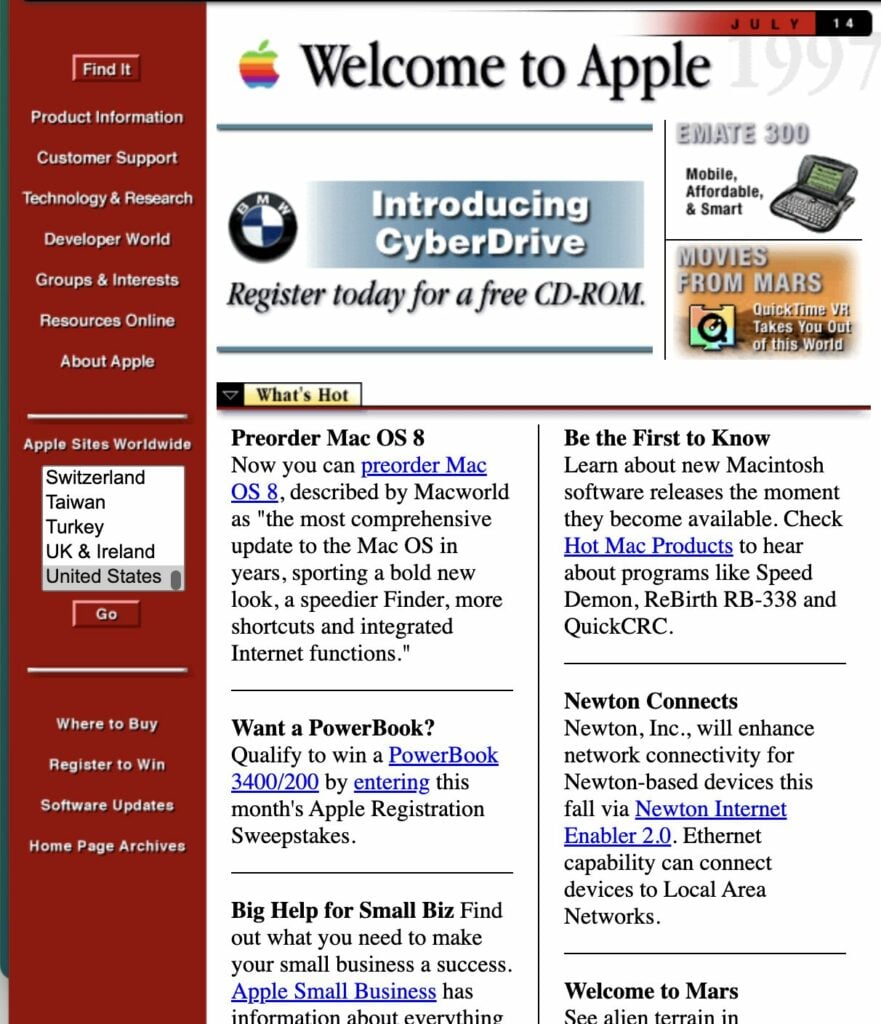
In the mid-1990s, websites were simple, static pages with limited visual elements and functionality. Text-based content dominated the screen, and the use of graphics was minimal due to slow internet speeds and limited bandwidth. Most web design looked something like what we see on the late-90s websites for Apple and ESPN (screenshots courtesy of the Wayback Machine):
Most of the design principles were based on printed design aesthetics, with a column structure borrowed from newspapers, but as technology advanced, web designers began experimenting with more visually appealing layouts and interactive features—exploring what an “unlimited” digital canvas might truly mean for their approach to design.
The introduction of JavaScript in 1995 allowed for dynamic elements and basic interactivity, while the launch of Flash in 1996 opened up new possibilities for animation and multimedia content. Perhaps the most significant milestone in this era of web design, however, was the introduction of Cascading Style Sheets (CSS) in 1998. CSS revolutionized the way websites were designed by separating content from presentation, allowing designers to have greater control over the layout and appearance of web pages—a development that paved the path to more consistent and visually appealing websites.
With the advent of mobile devices and the increasing popularity of smartphones in the late 2000s, web design faced a new challenge: creating websites that were accessible and user-friendly across a variety of screen sizes and devices. This led to the rise of responsive web design, an approach that ensures websites adapt seamlessly to different screen sizes and resolutions. Ethan Marcotte coined the term “responsive web design” in 2010, and designers quickly adopted the idea as an industry best practice.
The growing prominence of smartphones and tablets profoundly influenced contemporary website design. To cater to the requirements of users accessing the internet through these devices, designers now emphasize streamlined interfaces, intuitive navigation, and faster page loading speeds. As a result, features such as condensed menus, uncluttered layouts, and easily accessible navigation elements have become prevalent in current web design practices.
In recent years, a greater focus on user experience (UX) has arguably become the driving force in web design. Designers now place greater emphasis on creating intuitive, user-centric interfaces that prioritize the needs and preferences of website visitors. The use of interactive elements—animated graphics, parallax scrolling, and micro-interactions—has become increasingly popular as a means to enhance user engagement and create immersive experiences.
As we move forward, the future of web design looks increasingly dynamic and personalized. The rise of artificial intelligence (AI) and machine learning is set to revolutionize the way websites adapt to individual user preferences and behavior, though how that revolution will materialize in the design remains to be seen. Voice-activated interfaces and conversational UI are also poised to change the way users interact with websites, presenting new challenges and opportunities for web designers. As designers continue to push the boundaries of what’s possible on the web, one thing remains clear: the focus on creating engaging, intuitive, and purposeful user experiences will continue to shape the future of web design.
Principles of Modern Website Design
Simplicity and Minimalism: Modern website design embraces simplicity, focusing on clean lines, ample white space, and a clutter-free layout. By minimizing distractions, designers create a visually appealing and easy-to-navigate interface that allows content to take center stage.
Mobile-Aware Approach: With the majority of internet traffic coming from mobile devices, modern website design prioritizes a mobile-aware approach. This audience-first (rather than device-first) approach helps keep websites accessible and functional on mobile devices without compromising the desktop experience or prioritizing mobile as the primary focus.
Fast Loading Speed: Users expect websites to load quickly. Modern website design focuses on optimizing images, minimizing HTTP requests, and leveraging caching techniques to improve page loading times, reduce bounce rates, and keep user satisfaction high.
Intuitive Navigation: A well-designed navigation system is clear and concise, with easily found menus, a logical structure, and prominent calls-to-action so that users can find the information they need and take desired actions.
Visual Hierarchy: Modern website design institutes a visual hierarchy to guide users’ attention to the most important elements on the page. Through the strategic use of color, typography, and placement, designers create a visual path that directs users towards key content.
These principles work together to create a positive user experience, making modern websites intuitive, visually appealing, and easy to use. By prioritizing simplicity, mobile-responsiveness, speed, and clear navigation, modern website design helps businesses effectively communicate their message and achieve their online goals.
Trends Shaping Modern Website Design
Staying up-to-date with the latest trends, either because they provide valuable insights into user preferences and behavior or because they highlight a growing sameness among websites in a given industry or market sector, is essential to create a website that resonates with users and stands out from the competition.
Here are some of the key trends currently shaping modern website design:
Micro-Interactions: Micro-interactions are small, subtle animations or visual feedback that respond to user actions. These interactions—hover effects, loading animations, or confirmation messages—enhance user engagement by providing a sense of interactivity and responsiveness. When used strategically, micro-interactions make something static come alive, guiding users through the website, highlighting important elements, and creating a more enjoyable browsing experience.
Asymmetrical Layouts: Breaking away from traditional grid-based layouts, asymmetrical designs create visual interest and dynamism. By using unconventional placement of elements, designers can draw attention to specific content, evoke emotions, and create a unique brand identity. Asymmetrical layouts can also help guide users’ eyes through the page, leading to better engagement and conversion rates.
Personalization: With the rise of AI and machine learning, personalization has become a key trend in modern website design. By leveraging user data and behavior, websites can tailor content, recommendations, and even layout to individual users. Personalization enhances user experience by providing relevant and targeted information, increasing engagement, and fostering a stronger connection between the user and the brand.
Bold Typography: Typography plays a crucial role in modern website design, with bold and expressive typefaces taking center stage. Large, attention-grabbing headlines, combined with clean and legible body text, create visual hierarchy and improve readability. The strategic use of typography can convey brand personality, evoke emotions, and guide users through the content.
Immersive Scrolling: Immersive scrolling creates a captivating and interactive experience as users navigate through the website. By using animations, transitions, and dynamic elements that respond to scrolling, designers can create a narrative flow that engages users and keeps them interested in the content. Immersive scrolling can be particularly effective for showcasing products, telling brand stories, or presenting complex information in an engaging way.
By staying up-to-date with these trends and incorporating them into modern website design, businesses can create visually appealing websites that effectively communicate their message, engage users, and ultimately drive conversions. To create a website that stands out while staying contemporary, it’s essential to strike a balance between maintaining a unique brand identity and following trends.
User Experience (UX) in Modern Web Design
Intuitive, engaging, and user-friendly interfaces keep visitors coming back for more, which is why user experience (UX) is now a crucial aspect of modern website design. UX design encompasses various elements, including usability, accessibility, and overall user satisfaction.
The role of UX design in modern website design is to ensure that every element of the website works together. The ultimate goal is to provide a positive and frictionless user experience. To do that effectively means understanding user behavior, anticipating their needs, and designing interfaces that are easy to navigate and interact with. UX designers conduct user research, create user personas, and develop wireframes and prototypes to test and refine the design before implementation.
Improving a website’s UX typically involves the following steps:
Simplify Navigation: A clear and intuitive navigation system is essential for a positive user experience. Use descriptive labels, organize menu items logically, and make sure users can easily find what they’re looking for within a few clicks. Implementing a search function can also help users quickly access specific content.
Optimize Page Load Speed: Slow-loading websites can frustrate users and lead to high bounce rates. Optimize images, minimize HTTP requests, and leverage browser caching to ensure fast page load times. Consider using lazy loading for images and videos to improve initial load speed and keep users engaged.
Prioritize Mobile Adaptability: With the majority of internet traffic coming from mobile devices, websites must adapt seamlessly to different screen sizes. Use responsive design techniques, such as flexible layouts and media queries, to ensure that your website looks and functions well on smartphones and tablets.
Use White Space Effectively: White space, or negative space, can greatly enhance UX by improving readability and reducing visual clutter. By strategically using white space around content and design elements, you can guide users’ attention to key information and create a more visually appealing layout.
Provide Clear Calls-to-Action (CTAs): CTAs guide users towards desired actions, such as making a purchase, signing up for a newsletter, or contacting the business. Use prominent, visually distinct CTAs with compelling copy to encourage user engagement and conversion.
Perform A/B Testing: By creating two versions of a design element or page layout and randomly presenting them to users, businesses can compare engagement metrics and determine which version performs better. For example, for one client, we designed a new landing page and successfully used A/B testing to compare it with the existing landing page’s results. The test revealed that our new landing page outperformed the client’s former effort, leading to a 15% increase in conversions.
The Importance of Audience-First Design
In modern website design, adopting an audience-first approach is essential for creating engaging and effective online experiences. Audience-first design involves understanding your target audience’s needs, preferences, and behaviors, and tailoring your website’s design and functionality accordingly. By putting your audience at the center of your design process, you can create websites that resonate with users, foster engagement, and drive conversions.
One of the most significant shifts in audience-first design has been the prioritization of mobile experiences. With the majority of internet traffic now coming from mobile devices, designing with mobile users in mind is no longer optional—it’s a necessity. This shift has significantly impacted the design process, requiring designers to think “mobile-first” and ensure that websites are optimized for smaller screens and touch-based interactions.
Designing for mobile usually considers the following best practices:
Responsive Design: Implement responsive design techniques to ensure that your website adapts seamlessly to different screen sizes and resolutions. Use flexible layouts and responsive images to create a consistent and user-friendly experience across devices.
Prioritize Content: Mobile users often have limited attention spans and are looking for specific information quickly. Prioritize your content and present the most crucial information first. Use clear and concise headlines, bullet points, and short paragraphs to make your content easily scannable and digestible on small screens.
Simplify Navigation: Mobile navigation should be simple, intuitive, and easy to use with one hand. Use a hamburger menu or a bottom navigation bar to conserve screen space and ensure that users can quickly access the main sections of your website. Consider using drop-down menus or accordions to organize sub-categories and minimize scrolling.
Minimize Load Times: Mobile users expect fast-loading websites, and slow load times can lead to high bounce rates and poor user experience. Compressing images to reduce their file size without compromising quality and enabling browser caching to store frequently accessed files locally on the user’s device—two tricks of the trade, among many—can help speed things up.
Design for Touch: Mobile users interact with websites using their fingers. Designing for touch-based interactions means the buttons and links should be large enough for easy tapping. Gesture-based interactions, such as swiping or tapping, can also create a more intuitive and engaging mobile experience.
Incorporating Visual Elements in Design
If the goal is capturing users’ attention, communicating information effectively, or creating a memorable brand experience, then the use of high-quality images, videos, infographics, and animations can help engage audiences and distinguish your website from your competitors.
High-quality visuals aren’t just pretty; they make content more appealing, informative, and shareable. Images and videos can showcase products, services, or brand stories in a way that text alone cannot. Infographics can simplify complex information and make it more easily digestible for users. Animations can add interactivity, guide users through content, and create a more dynamic and engaging experience.
Incorporating visual elements into a website design often includes a consideration of the following best practices:
Choose Relevant, High-Quality Visuals: Select images, videos, and graphics that are relevant to your content and align with your brand identity. Use high-resolution visuals that are clear, crisp, and visually appealing. Avoid using generic stock photos whenever possible and opt for unique, authentic visuals that resonate with your target audience.
Optimize for Performance: Visuals, especially video, can impact website performance if they’re not optimized properly. Large image and video files slow down page load times, which leads to increased bounce rates and frustrated visitors. To balance visual appeal with performance, compress images and videos, use appropriate file formats (such as JPEG for photos and PNG for graphics), and implement lazy loading to prioritize above-the-fold content.
Use Alt Text and Captions: For accessibility and SEO purposes, always include descriptive alt text for images and captions for videos. Alt text helps visually impaired users understand the content of an image, while captions provide context and improve the searchability of your video content.

Integrate Visuals with Content: Visual elements should complement and enhance your written content, not distract from it. Use images and videos to break up long blocks of text, illustrate key points, and provide visual context. The placement of visuals should follow a logical flow and guide users through your content.
A successful example of incorporating visual elements in website design is the use of custom illustrations and animations on a blog. By creating unique, branded illustrations and using subtle animations to guide users through the content, a website can see a significant increase in average time spent on the page and a reduction in bounce rates.
It’s important to continuously test and optimize visual elements to strike the right balance between visual appeal and performance. By using tools like Google PageSpeed Insights and conducting user testing, designers can identify areas for improvement and make data-driven decisions to enhance the overall user experience.
By incorporating high-quality, relevant visual elements into your website design and following best practices for optimization and responsiveness, you can create a visually stunning and engaging user experience that sets your brand apart and drives business success in the modern digital landscape.
SEO Considerations in Modern Website Design
Modern website design practices have evolved to incorporate search engine optimization (SEO) considerations, which play a vital role in driving traffic, improving visibility, and ultimately, contributing to the success of a website.
One key aspect of SEO-friendly website design is site structure. A well-organized site structure helps search engines understand the hierarchy and relevance of your content. By using clear, descriptive URLs, implementing a logical navigation system, and creating a comprehensive sitemap, designers can improve the crawlability and indexability of a website. A well-structured site also enhances user experience, making it easier for visitors to find the information they need.
Content readability is another important consideration in SEO-friendly website design. Search engines favor websites with high-quality, relevant, and engaging content. Designers can improve content readability by using clear, legible fonts, implementing a hierarchical heading structure (H1, H2, etc.), and breaking up long blocks of text with images, videos, or other visual elements. By making content more accessible and easier to consume, designers can improve user engagement and signal to search engines that the website provides value to its audience.
Here are some additional SEO tips that designers and developers can implement without compromising the visual appeal or user experience of a website:
Use Descriptive, Meaningful Page Titles and Meta Descriptions: Page titles and meta descriptions are crucial elements for SEO, as they appear in search engine results pages (SERPs) and can influence click-through rates. Use concise, descriptive titles that include relevant keywords, and craft compelling meta descriptions that accurately summarize the page content.
Optimize Images and Videos: Visual elements can greatly enhance user experience, but they can also impact website performance and SEO if not optimized properly. Use descriptive, keyword-rich file names and alt text for images, and consider compressing large files to reduce page load times. For videos, provide transcripts or captions to make the content more accessible and indexable by search engines.
Implement Structured Data: Structured data helps search engines better understand the content and context of a website. By implementing structured data, designers can enable rich snippets in search results, such as star ratings, review counts, or product prices, which can improve click-through rates and drive more qualified traffic to the website.
Prioritize Internal Linking: Internal linking helps search engines understand the relationships between different pages on a website and can also improve user navigation. By strategically linking to relevant internal pages using descriptive anchor text, designers can boost the visibility and authority of important content while providing users with additional resources and context.
By considering SEO throughout the website design process and implementing these tips, designers and developers can create websites that are not only visually appealing and user-friendly but also optimized for search engine visibility. By striking the right balance between aesthetics, functionality, and SEO, modern website design can drive more qualified traffic, improve user engagement, and ultimately contribute to the success of a business in the digital age.
Case Study: A Holistic Approach to Brand Engagement
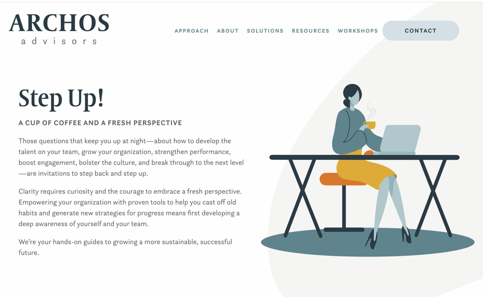
Challenge: Archos Advisors sought to strengthen its brand and engage potential customers by showcasing its expertise in areas such as talent development, growth strategies, change management, and cultural fortification.
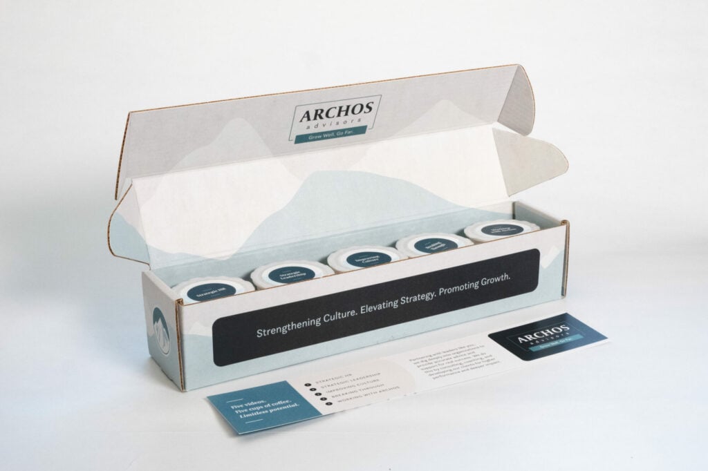
Solution: Rare Bird developed a holistic, multi-faceted campaign called “Step Up!” that began with redesigning Archos Advisors’ website to better showcase their expertise and services. The campaign then integrated various marketing elements, including:
- Direct mail package containing five individually-themed coffee pods, timed to arrive the weekend before five emails were scheduled
- Daily personalized emails guiding recipients to video content on dedicated landing pages related to the themes introduced by the coffee pods
- Clear calls-to-action on each landing page, encouraging prospects to schedule consultations
By combining web design, printed marketing materials, direct mail, and digital marketing, Rare Bird created a comprehensive, immersive experience for Archos Advisors’ potential customers.
Results:
- Increased brand awareness and recognition for Archos Advisors
- Higher engagement rates with the firm’s content and services
- Substantial increase in consultation requests and new business opportunities
- Positive feedback from prospects regarding the campaign’s creativity and value

The Future of Website Creation: Blurring the Lines Between Design and Development
The future of website creation demands a multidisciplinary approach that leverages the skills and expertise of a team of designers, developers, storytellers, and analysts. By collaborating closely and staying informed about emerging trends and technologies, such professionals can create a website for your business that is visually appealing, technologically advanced, and future-proof (at least for a few years).
To prepare for this future, businesses must invest in the creation of their website and value flexibility and agility in the partner they choose to manage the creation of this important investment. Embracing a holistic, user-centric approach is a necessity—not a luxury—for businesses wishing to remain competitive and relevant. As user expectations continue to evolve and new technologies emerge, companies must prioritize delivering the best possible user experience to stay ahead of their competition.
Throughout this guide, we have explored the key aspects of modern website design, from its evolution and guiding principles to the latest trends and future predictions. By understanding the importance of user-centric design, mobile optimization, visual storytelling, and the integration of design and development, business leaders—such as marketing managers, chief marketing officers (CMOs), digital marketing specialists, user experience (UX) designers, product managers, and entrepreneurs of all kinds—can secure the design of websites that captivate and engage their current and potential customers.
If you haven’t already, now is the time to evaluate your current website design and consider whether it aligns with the best practices and trends outlined in this guide. A refresh or redesign that incorporates modern design principles can help you stay ahead of the curve, improve user engagement, and ultimately drive more success for your business.
You might also like:
Rare Bird delivers versatile marketing and digital solutions to diverse clientele across nearly every industry. Ready to leverage our expertise to address your business needs?
Let's talk.